Intuitive Tech
Redesigning home technology products with the visually impaired in mind. Intuitive Tech utilises texture and form to provide unique sensory cues creating a truly intuitive experience and making everyday tasks a little less complicated. This project aims to increase tactile interaction and optimise visual potential whilst keeping a sleek, refined aesthetic reducing overall stigma surrounding visual impairment and the use of specialist products.

According to a 2020 report published by the World Health Organisation 2.2 billion people have some form of visual impairment. From a design perspective, that number represents 100,000 in every million users that would struggle to use a traditional home technology product.
Adults with vision impairment often have lower rates of workforce participation and productivity and higher rates of depression and anxiety. 43% of individuals struggle to carry out everyday tasks whilst 73% report a difficulty in using everyday design products.
By adopting a user-centred design strategy and designing with accessibility in mind it ensures people with disabilities can access the same information from a product as everyone else and in turn gain the same benefits.
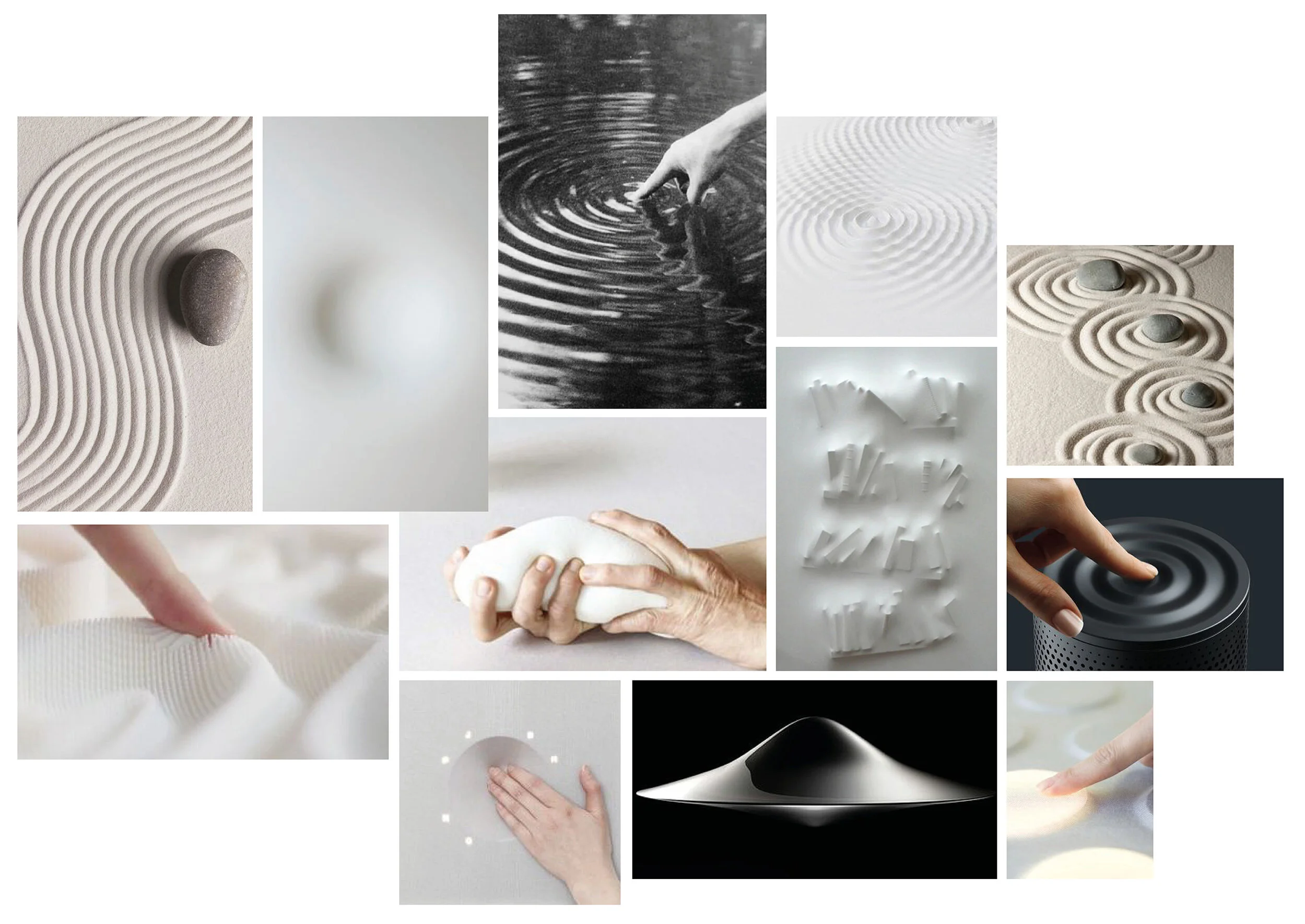
USER RESEARCH
Initial research is focused around identifying how the visually impaired typically interact with their designed environment. Aspects such as colour, texture and form perception become key areas of interest, from this information design principles are identified and a design direction is formed.
Textural Contrast
Colour Contrast

Tonal Contrast
When colour is removed saturation (or tone) of colour becomes very important. It is therefore best to avoid using two colours of a similar tone (as in image A) and instead opt for colours with a high tonal contrast.
Complementary Colours
Colours that are opposite one another on a colour wheel can be problematic when paired together. Often it is beneficial to consider using colour combinations that sit adjacent to one another instead. (Image B)
Luminous Contrast
Luminous contrast refers to the amount of light reflected from a surface colour. A 30% luminous contrast difference between two colours is generally the minimum discernible by a person with partial sight. (Image C)
Monochromatic Colour
Contrasting shades of the same colour are often easier to distinguish than contrasting shades of two different colours. It is therefore often beneficial to consider mono-chromatic or duo-chromatic colour palettes. (Image D)
Spacial Representation

Intuitive Form

Spatial Representation: those who are visually impaired often struggle with spatial awareness and to differentiate between sizes of products. In such instances pattern can be used to signify such size differences, the larger the pattern the larger the product and vice versa.
Intuitive Form: form can play a key role in signifying intended use of a product or system and is a simple way to introduce user direction.
Conclusive Design Principles

Intuitive Form

Shaded Colour at 30%+ Luminosity

Contrasting Textural Differences

Guiding Pattern
DESIGN DEVELOPMENT

CONCEPT
Haptic Residue
Form and patination is inspired by the residue leftover from human touch. Soft shapes and rounded edges bring a comforting quality to the haptic experience whist indentation and protrusion creates tactile interest. Both haptic and non-haptic detailing act as a sensory cue guiding the user towards areas of importance such as buttons and dials.
CMF DESIGN STRATEGY
Tactile Touch Points: tactile interest is applied for key areas of haptic importance such as buttons, dials and hand held sides
Highlight Colours: colour is used in a considered yet bold way often offset against a neutral such as black or white. Particularly implemented to draw attention to areas of importance such as buttons and dials
Textural Differences: textural Differences are utilised in order to bring both functional and emotional interest to the product

Intuitive Form

Tactile Touchpoints

Highlight Colour

Textural Differences
PATTERN
Twist

Push

Slide

MATERIAL

1mm Various Perforation Levels

20 Filan Thread Various Colours

PVC

3mm Black Gloss Acrylic

3mm White Gloss Acrylic

Copper 0.5mm
COLOUR

FINAL SAMPLES
Collection A


Collection B


KEY DESIGN FEATURES
Volume increase is signified by raised area whilst decrease is signified by an indented button.
Hard Surfaces are predominately there to ‘fill in space’ - acting as an imperative form of white noise and a contrasting material to softer more tactile elements.
Tactile pattern is used on the areas that are to be held, pattern size is scaled in relation to the product allowing the user to identify its overall size quickly and efficiently. Pattern is kept simple and easy to distinguish.
Soft and squidgy textures are to be pressed, touched and interacted with, such as buttons, dials and knobs.
Form is used to guide the user in the function of the product. Hand held areas are formed to fit the users hand whilst raised areas signify an increase and indented areas a decrease.